
 To meet your customers' demands as a discrete manufacturer, you need to create a product line with various products and options with many possible configurations. Designing your product line for your customers in a way that is not confusing and in the same time meets their personalization needs can be a challenge. Visualizing entire product lines is a way to ensure it is serving the market needs and is easy to understand from a customer's perspective. It is also an essential tool to strategically communicate what is being built and how it serves the market, enabling everyone inside the organization to stay aligned and informed.
Challenges of designing product lines
Designing a line of products requires a deep understanding of your customer segments and their desires. If all customers preferred the same exact product, there would be no point in designing a product line. A single product variant would do! But the reality is that customers often have unique needs or seek to differentiate themselves based on their personal preferences.
Overly complex product line designs often cause confusion in the market, and cause complexity in manufacturing them. This is called choice overload. In this case, the customer will have a tough time configuring the product to their liking. Another scenario is when products in a product line have very little differentiation between them, causing commonality or similarity confusion. In this case, the customer will have difficulty understanding the difference between the products, especially if the price is different. You can see an example of the implications of too much commonality on GM product lines in this article by Automotive News.
How product line visualization can help
Visualizing your product line from different perspectives is a powerful tool that allows product teams to collaborate and immediately see issues that need to be addressed. This is especially true when the product line is complex, having many products, variants, and options. Visualization tools are also a powerful way to increase transparency and communicate changes to set your entire product line's direction across the organization.
Having standard ways to visualize your product lines simplifies and speeds up communications and decision making in your team. Below we show three different ways you can visualize the configuration of your product at a specific time.
Product matrix
A Product Matrix, also known as an OXO chart, product direction matrix, or configuration matrix, is a visual way to show all the possible ways products can be configured, how features are made available and reused across products in a product line, and how selecting an option impacts availability of other features on a product.
The example below is a product matrix for a bicycle line. Products are outlined in the header, while the features to be included are listed on the rows. Each cell shows how the feature is configured or made available on that product. The features can be Standard (S), Optional (O), or Not Available (-) on a product.
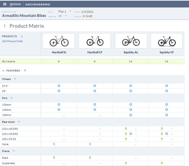
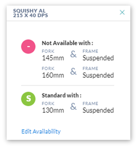
Interestingly, you can see from this chart that you can configure a feature in multiple ways on the product depending on other feature selections. For example, on the Squishy AL product above, Shock 215 x 40 DPS can be Standard (S) or Not Available (-) depending on the selection of other features.
You can see the dependency of this example in the detailed image for that cell below:
Creating a product matrix is a powerful tool, but as products and availability conditions increase in complexity, ensuring accuracy, and maintaining the changes can become a challenge. Keeping a product matrix alongside other visualizations in sync using spreadsheets, PowerPoint, and word documents are time-consuming and error-prone. In such cases, automated software such as Gocious can help speed up the creation, standardize the format, and reduce mistakes in managing this depiction.
Product walk
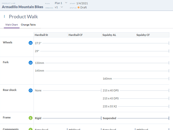
Even though the Product Matrix shows you how features are configured on your product, it doesn't clearly depict how your products differentiate themselves from one to the other. The product walk shows how features change from product to product as you "walk" the product from left to right. In this model, the order of products matter. For example, products can be ordered from left to right as they increase in customer value.
In the images below, you can see two ways of depicting a product walk. Both show how products evolve from left to right. The example below shows that Squishy products provide additional fork and rear shock with option compared to Hardtail.
The chart below shows when features belonging to the same option group (feature family) switch across the products.
The following board is another view depicting the same but shows features added or removed from the product on its left to configure the next product. In this case, you can see that Squishy adds a suspended frame as a standard feature compared to Hardtail and naturally removes the rigid frame.
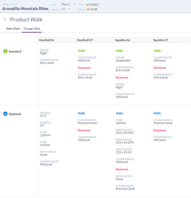
With this model, one can easily validate how one product is different from the other and assess whether the change is significant enough to clearly differentiate the product.
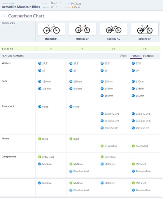
Product comparison chart
Comparison charts are another way of depicting your product line. This chart is a view of how customers would generally understand or view your product line. Unlike the product matrix, the product comparison objective is to compare features side-by-side between products, not how features are configured on each product. It is also an excellent way to compare your products with your competition.
The image below shows the same product line. You can clearly see what is different and what is common between each product using this chart in one glance.
Designing and communicating the optimum product line is challenging and requires many inputs from different stakeholders. Visualizing product lines improves collaboration and communication across the organization. It also facilitates analysis of the line. There are many ways to depict product lines, but the three above provide a quick way to visualize the product line on one canvas to collaborate on, with each having its unique use. With these types of visualizations, you can collaborate with your team and align everyone around a common product line strategy faster and in a way that everyone understands. And it doesn't end there. You can also use these visualizations to benchmark your products against competing products as part of your competitive analysis.
At times, the challenge can be the upkeep, standardization, and modeling of configurations using general productivity tools such as spreadsheets and powerpoints. With software like Gocious, you can automate the creation, speed up the modeling, and improve accuracy by defining your product line in one place using intuitive rules to show how the features are configured on the product and visualize it in different ways from the same set of data. Furthermore, you can create a product configuration roadmap by incrementally changing and creating snapshots of product line models over time and tracking changes from one snapshot to the next, as we explain in this article.
Automate and simplify modeling of product lines with Gocious - Signup and try Gocious free for 30 days.